Alpha Systems was a project that I worked on during my Typography II class at Michigan State. I was tasked with taking the Baskerville typeface and applying a set of rules to it to essentially make my own font. Baskerville was treated as the backbone of the typeface, and the steps allowed for it to be altered to the point where it is unrecognizable. I have listed below the steps of the process and some further context on the project as a whole.
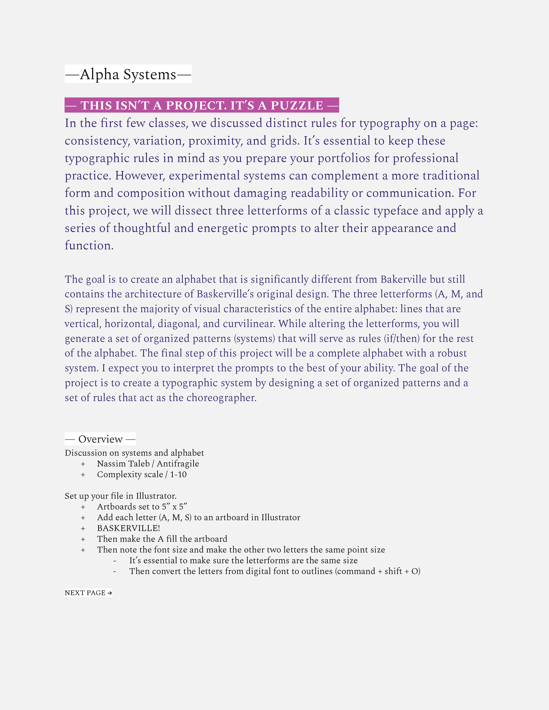
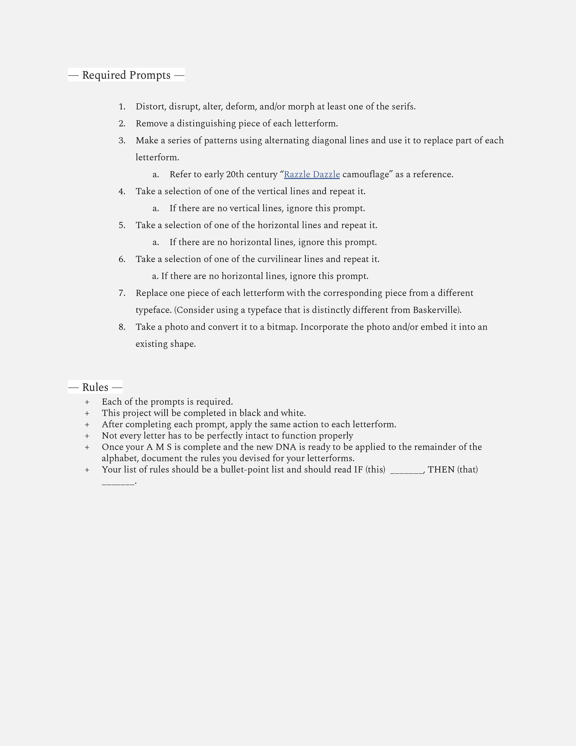
Above are the directions that I was given on how to create the rules for this project puzzle. I was tasked with making 8 rules that I had to stick to in order to keep consistency with the entire typeface.
The rules I came up with are as follows:
+ If there are serifs, then remove them.
+ Remove a diagonal line from any geometric letterform
+ If there are no diagonal lines, remove a vertical line
+ Remove a portion of the upper section curve of the letterform
+ Replace it with razzle dazzle
+ Add razzle-dazzle to the thicker diagonal line section
+ If there is no diagonal line, then razzle dazzle the thickest vertical line
+ If there is a vertical line, then copy it and add it next to itself
+ If there is a horizontal line, then do the same as above
+ If there are only diagonal lines, then do the same as above
+ If there are only curvilinear lines, then repeat the above process
+ Replace a portion of each letterform with a piece of the Courier new font
+ You will be replacing/adding a serif to the letterform
+ If the letterform if composed of only organic shapes, do not add a serif
+ Bitmap a diagonal line
+ If there is no diagonal line, then bitmap upper half vertical line
+ If there are no straight lines, bitmap an upper half curvilinear bitmap for organic forms
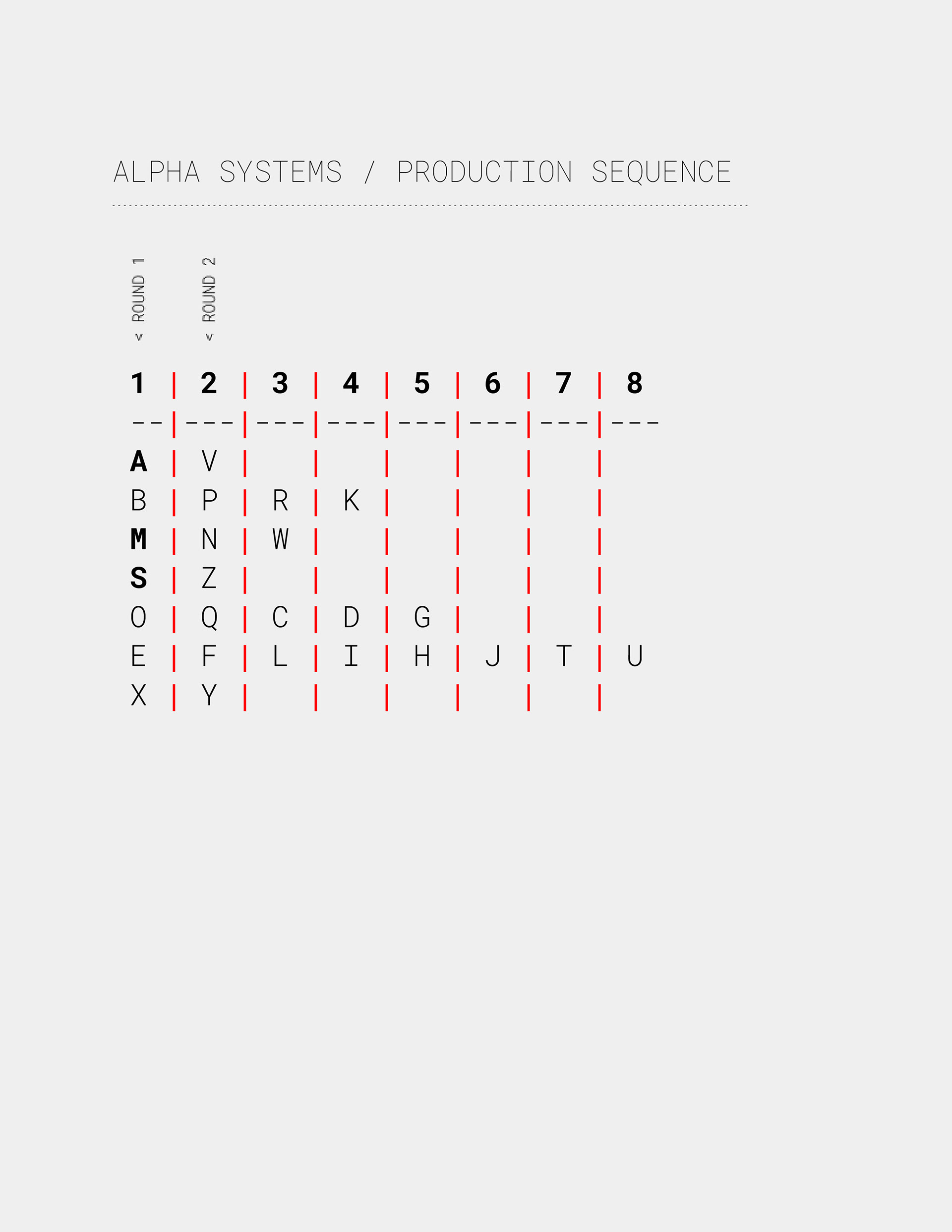
This was the chart that I was given to help figure out the order in which I should make each letter. The first two rounds were very important as those letters were used as a reference for the rest of the alphabet.
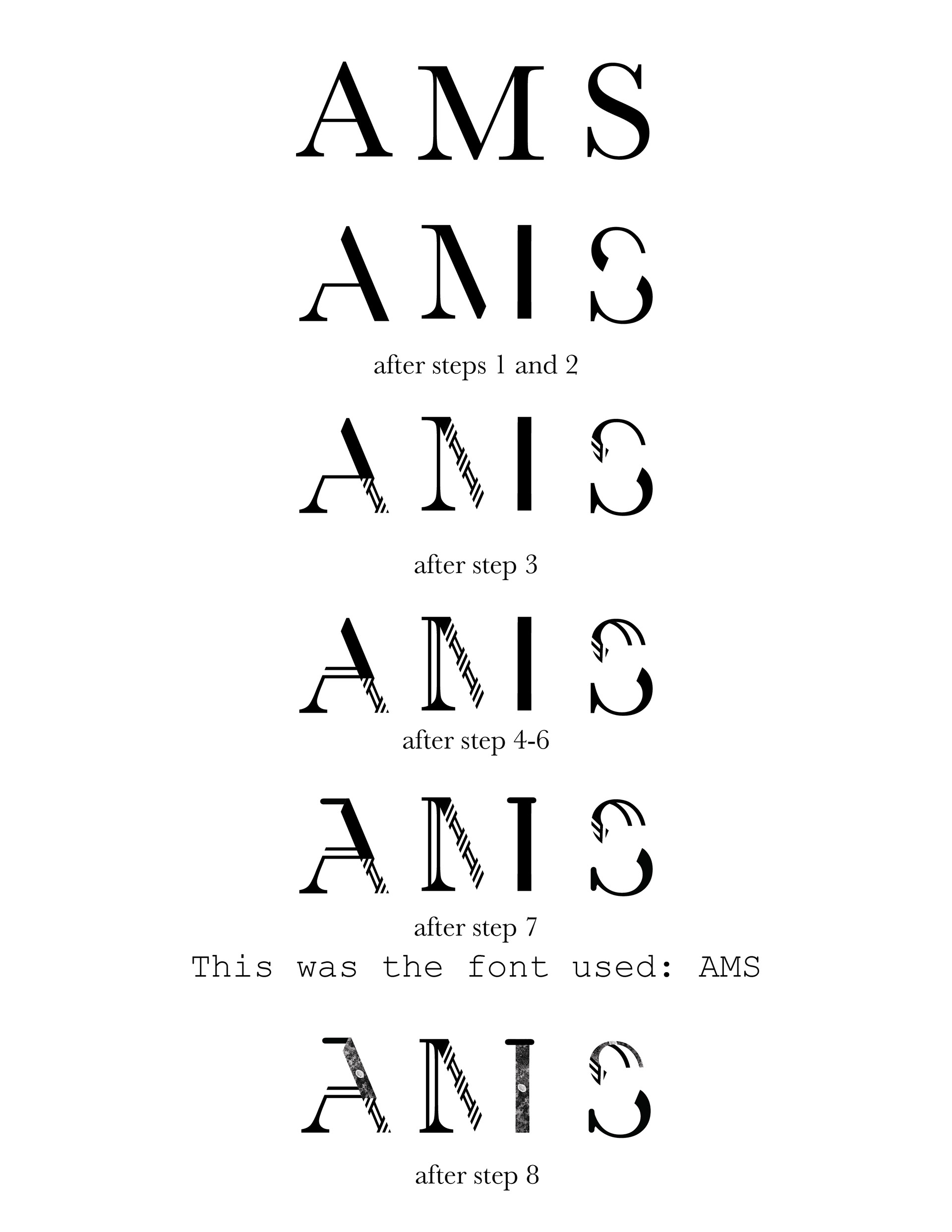
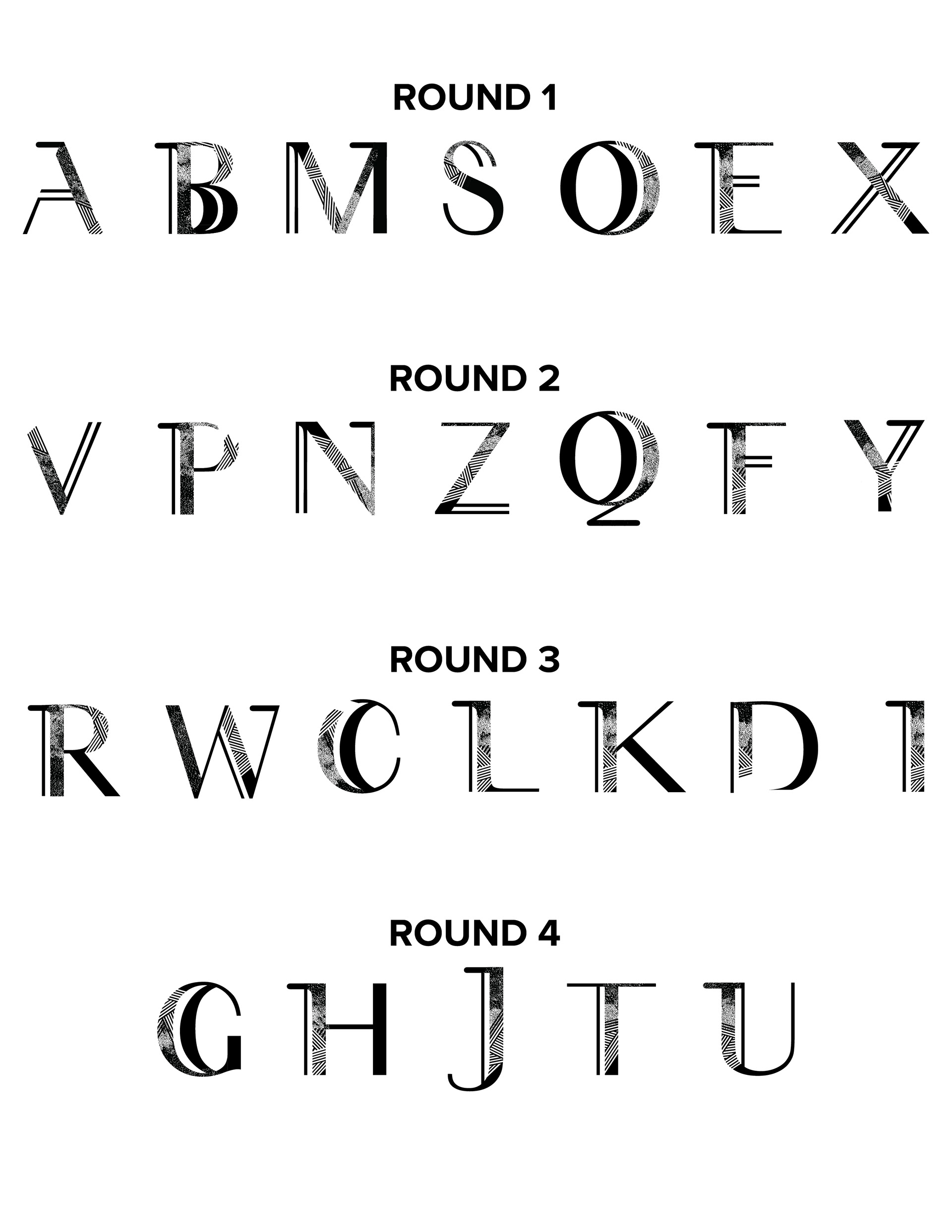
To the left are the first three letters I made that were as strong a backbone as you can get. This was also where I was deciding if the rules I made worked and were able to be replicated across at least a majority of the letters. The rules I went over above can be seen being put to action in AMS. To the right is the rest of the rounds, which I have also mentioned above, and how those letters turned out as the rounds went on. The only thing I needed to do after I was done with all of the rounds was to organize the letters alphabetically.
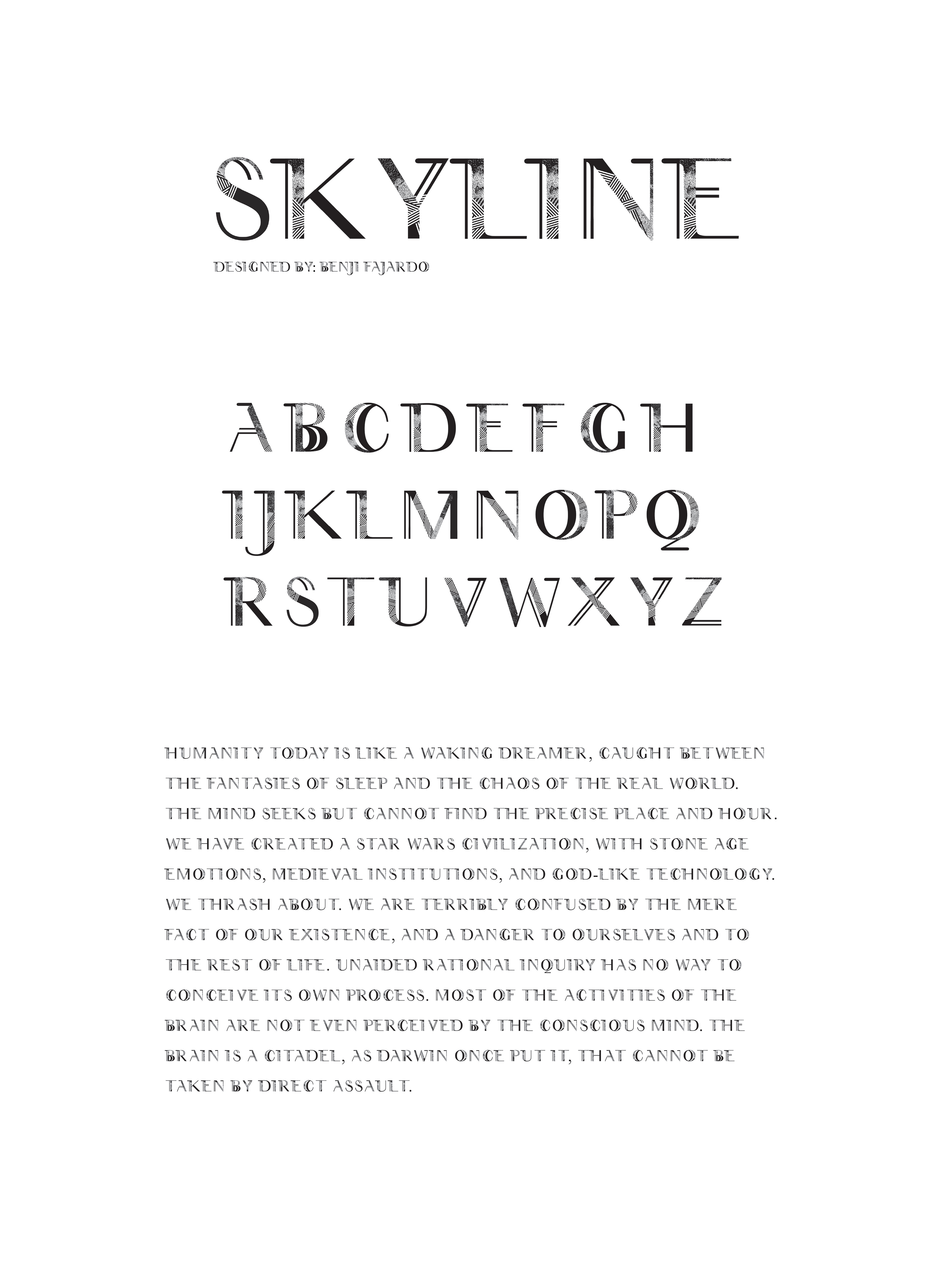
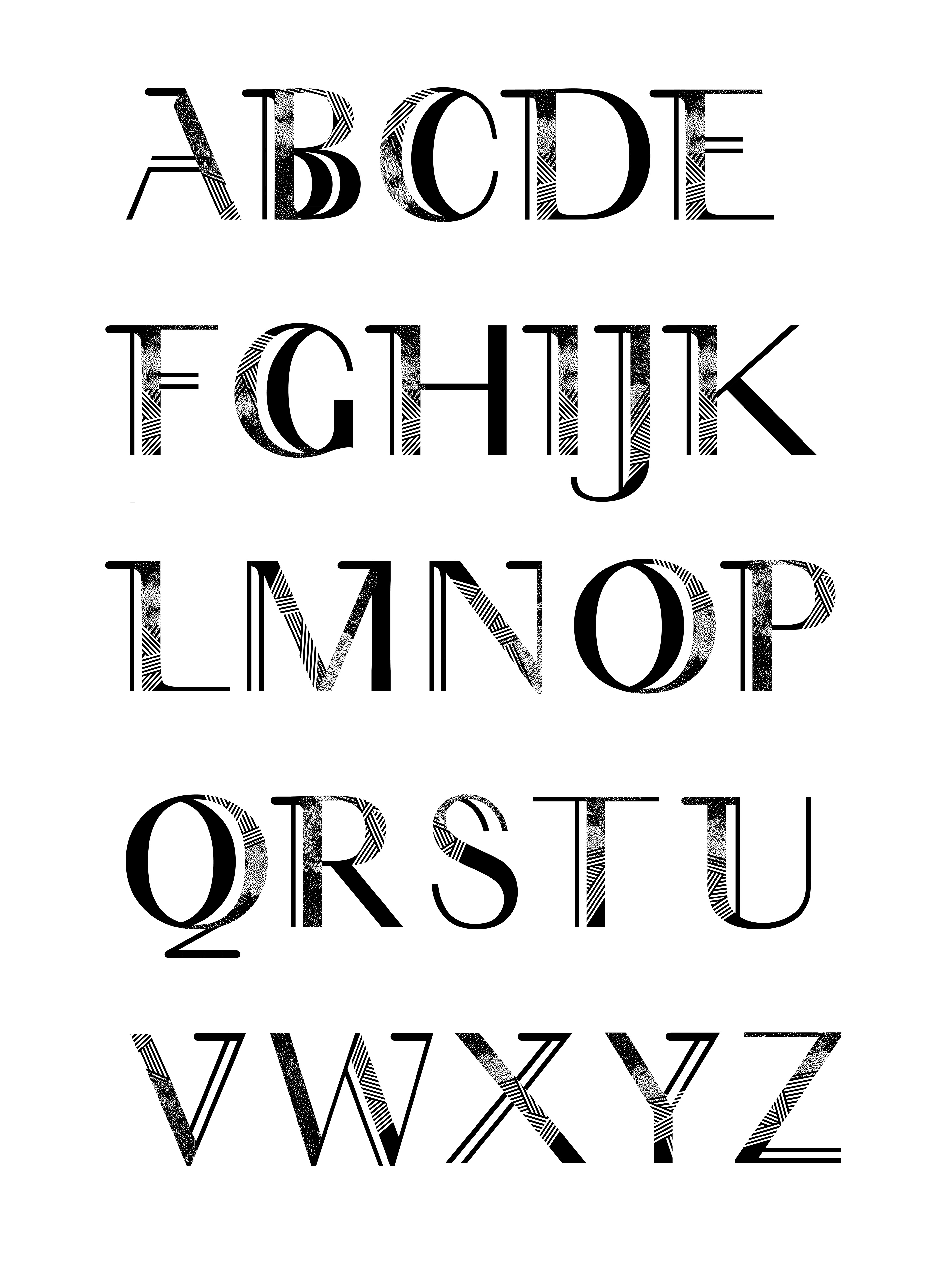
Above is the finished product, the new typeface I had made. That Baskerville backbone is still there if you look hard enough, but thanks to the parameters I set for the project, I was able to come away with a new typeface I could call my own. I named it Skyline and was also tasked with "writing" out a paragraph of text that we were given to have an example of the typeface in use.