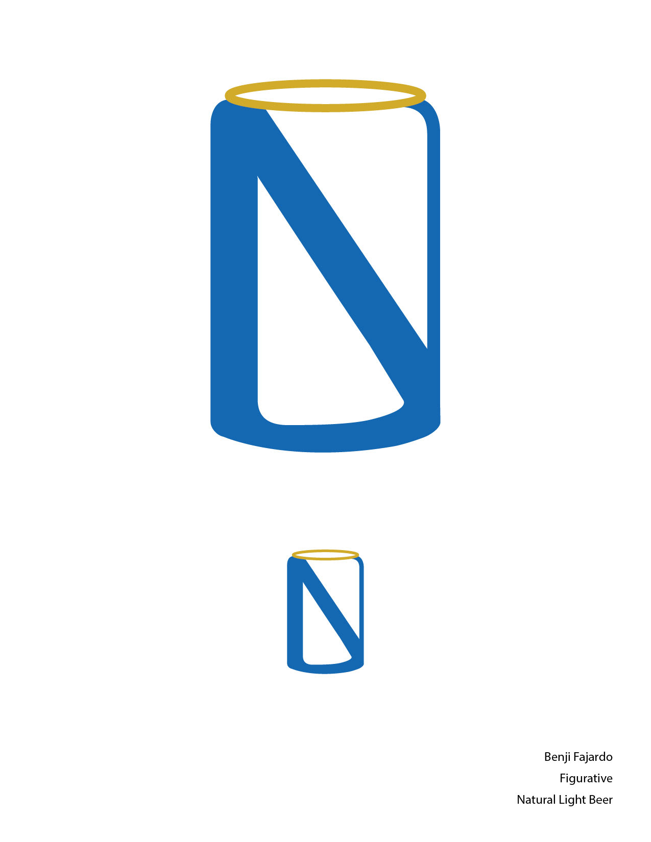
"NL" in the shape of a beer can
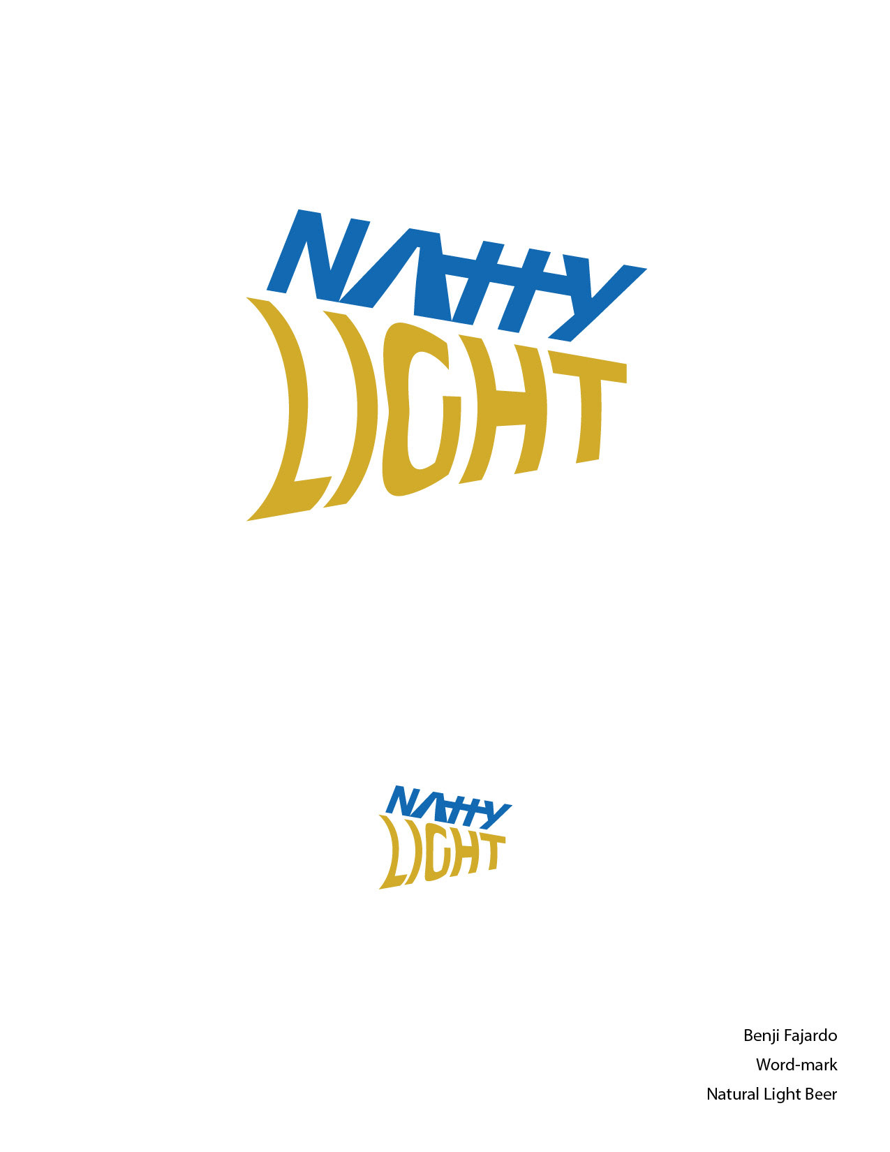
Abbreviation of the name with "light" in the shape of a beam of light.
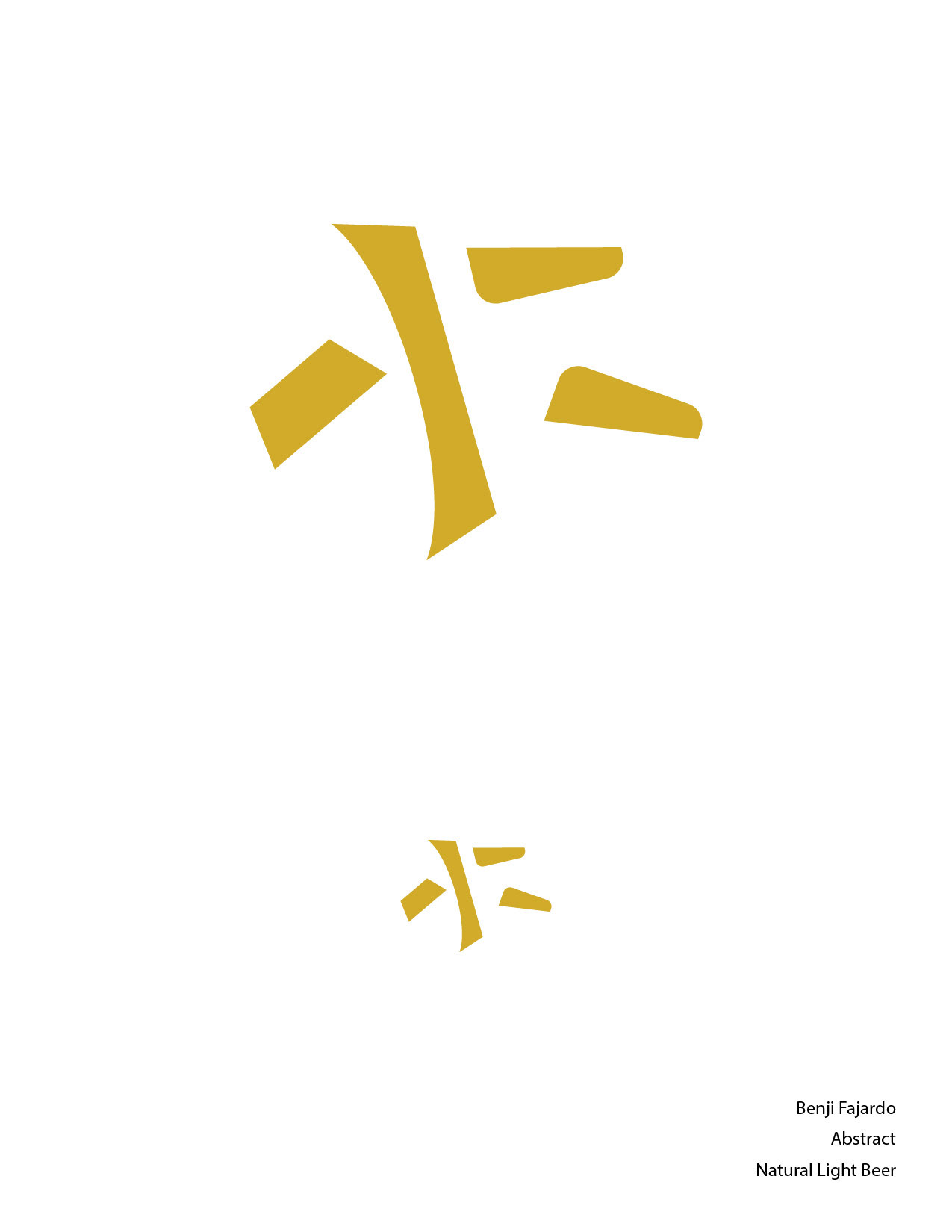
An abstract close up of a barley stem
For my figurative logo, I wanted to recreate the minimal look that the newer Natural Light cans have. I wanted the N and L to be a part of the form of the can, and I put a gold ring on top of the can to emphasize the wheat/barley imagery that comes with beer.
For the word mark logo, I wanted to play with the type and the shortened name Natty Light. I wanted to give the logo a youthful feel to go away from the elegant feel that the current cans have. The main target audience for Natural Light is older men (50s +), and I wanted to get the attention of the college-age drinking market with the word mark. I wanted the word light to look like a beam of light, and I think the tilt it creates on the word Natty really aids in giving it a youthful feel.
For the abstract logo, I wanted to pull from the barley stem itself. I wanted to represent the stem with the buds on it, while also ensuring some ambiguity of what it could really mean to a first-time viewer, to ensure abstraction. I found that going with all gold was a strong choice, but had I given this one another attempt, I may have played with making the buds blue or red, the other two colors in the palette.
I wanted to avoid using red for the most part in this design because I felt that Budweiser had honestly claimed the color red for beer, and the more red I used for Natural Light, the less it felt like it represented the taste of the beverage itself. I think the gold/yellow color really helped in establishing the flavor of the beer, and the blue helped establish some elegance that the brand was already trying to do with their can redesign.