I was tasked with redesigning a current album cover and coming up with one main design and two backup variations. The original cover was made solely using AI, which allowed for me to create designs that had little to nothing to do with the original.
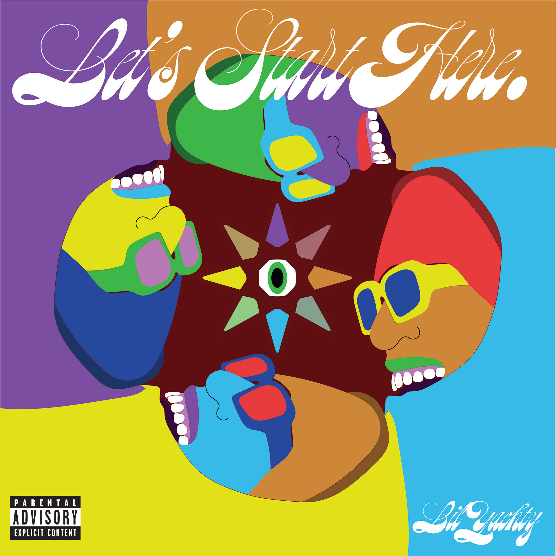
This was my main cover idea in which I used fully vectorized images. I traced a picture of Lil Yachty I found and broke up the image into individual sections, which allowed me to change the color of the different sections of the portrait. The album is a mixture of psych rock, rnb, and indie rock, and I wanted to ensure that the viewer understood the genre before listening to the music. This is also what led me to pick the vibrant color palette and the psychedelic script font. I wanted to fill the space in the middle without overstimulating the viewer, which is why I conjured the eyeball with starfish-like spikes coming off it. I used the color palette I had come up with for the portraits for the spikes as well to fuse the eyeball into the rest of the cover.
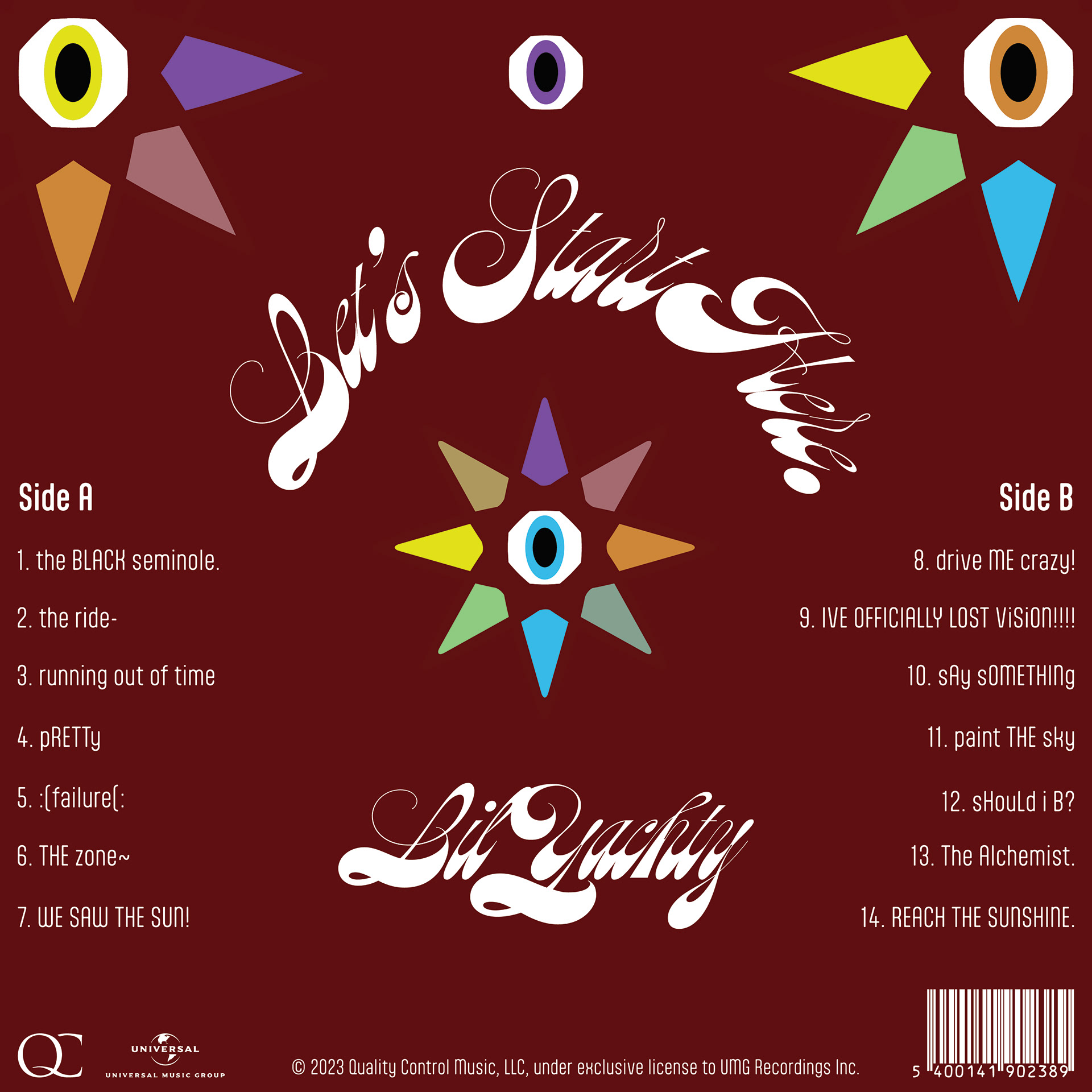
I then designed the corresponding back cover in which I wanted to keep the psych rock theme going while still allowing for full legibility. I kept the spiky eyeball in the same position to allow for cohesion between both sides and used the same script type for the album name and artist name. I wanted to make sure the tracklist was fully legible, which is why I went with a serif typeface instead of continuing the script one. Since the album had an even 14 songs, I decided to break them up by A and B sides in order to fill the space but also continue the symmetrical setup I had going on with the front. I made sure to add the label logos and a barcode along with the copyright all at the bottom, making sure they were all legible but not the focal point.
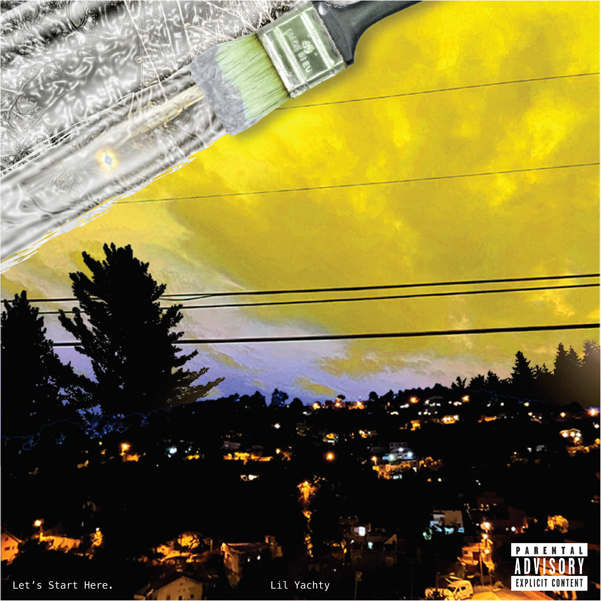
For my first backup cover idea, I wanted to do something that was reminiscent of the late 90s, early 2000s photographic album covers. I took an image I had taken in the outskirts of rural Barcelona and made a collage with a different image of a vibrant-looking sky I had taken in the States. I wanted this cover to be a reference to the song "Paint the Sky" that is on this record. I took an image I had taken outside of my apartment and applied multiple textures over it to give it a silver paint-type look. Since the bottom of the cover was relatively busy, I decided to keep things pretty minimal with the type, putting the album title on the bottom left and the artist name on the bottom middle of the cover. I used the advisory warning as a way to balance out the information on the cover. This collage consisted of a lot of effects and photo adjustments to get the color palette of the final result.
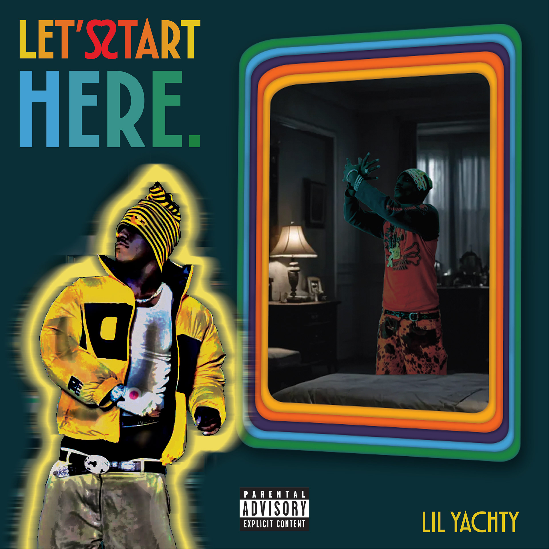
For my second backup cover, I had this idea of Lil Yachty walking away from a reflection of himself in the mirror. This was the only cover in which I used imagery that I had not taken myself. I started by making the version of the artist that was in the mirror, taking a photo of him doing a bird flying emote, and inserting it into a dimly lit room. I made the frame of the mirror in Illustrator, taking inspiration from 70s image border aesthetics. I then took another image of the artist and layered multiple effects over top to give him that oversaturated look and the outer glow/blur effect. I didn't want to do too much with the background since there was already a lot going on visually with the two versions of the artists. I wanted the type to be visually interesting, which is why I decided to turn two S's into a heart shape. I then made gradients with each letter based on the color choices I made for the mirror frame. I made the artist's name in the same font but a thinner weight and a bright yellow that contrasted with the background.